
Fifa Football Mobile
A UX/UI Case Study
Disclaimer: I didn’t work for EA, this is a customer’s point of view.

Recently I had a job interview with EA where I had the fun opportunity to provide an initial UX perspective of the FIFA Football game. So I sat down, downloaded it on my Android device and went through the Academy phase of the game.
The Process
In the limited time I had to analyse the game, I took the following steps.
Benchmark
Most sports games are from EA, and I checked some of their other games like MyNBA2K21. Given however there didn’t seem to be major differences between them, I looked into other mobile action games like Brawl Stars which has similar commands.Testing
I had a couple of friends play the game themselves. Neither of them plays FIFA, so I could gather information from the point of view of new players. The testing environment was at times chaotic due to disruption from surrounding pets or people, which recreated the kind of setting the average person could be in while playing.
Of course, I also tested the game myself.Sketching of solutions to pain points
I took screenshots of the game and edited them in Photoshop for which visualisations of how to enhance the game experience.
The Pain Points

The testing sessions were recorded.
The following pain points were noted during the tutorial part of the game.
Small text and lack of focus points
Team colours
Direction of movement
New unexplained elements
Solutions
Small text and lack of focus points
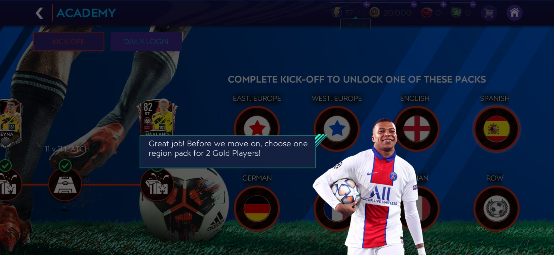
The tutorial text is too small for mobile and hard to read, so it needs to have a bigger font. The contrast between the text and background colours seems to be strong enough, it could however be enhanced.
There is also a lack of focus when multiple text boxes pop up, for example when a TIP comes up next to the OBJECTIVE (see picture below). The highlight around the objective is static and in the same hue as the surroundings, so it doesn’t attract attention. Changing the colour or animating the highlight to pulsate could be a suitable fix.


Team colours
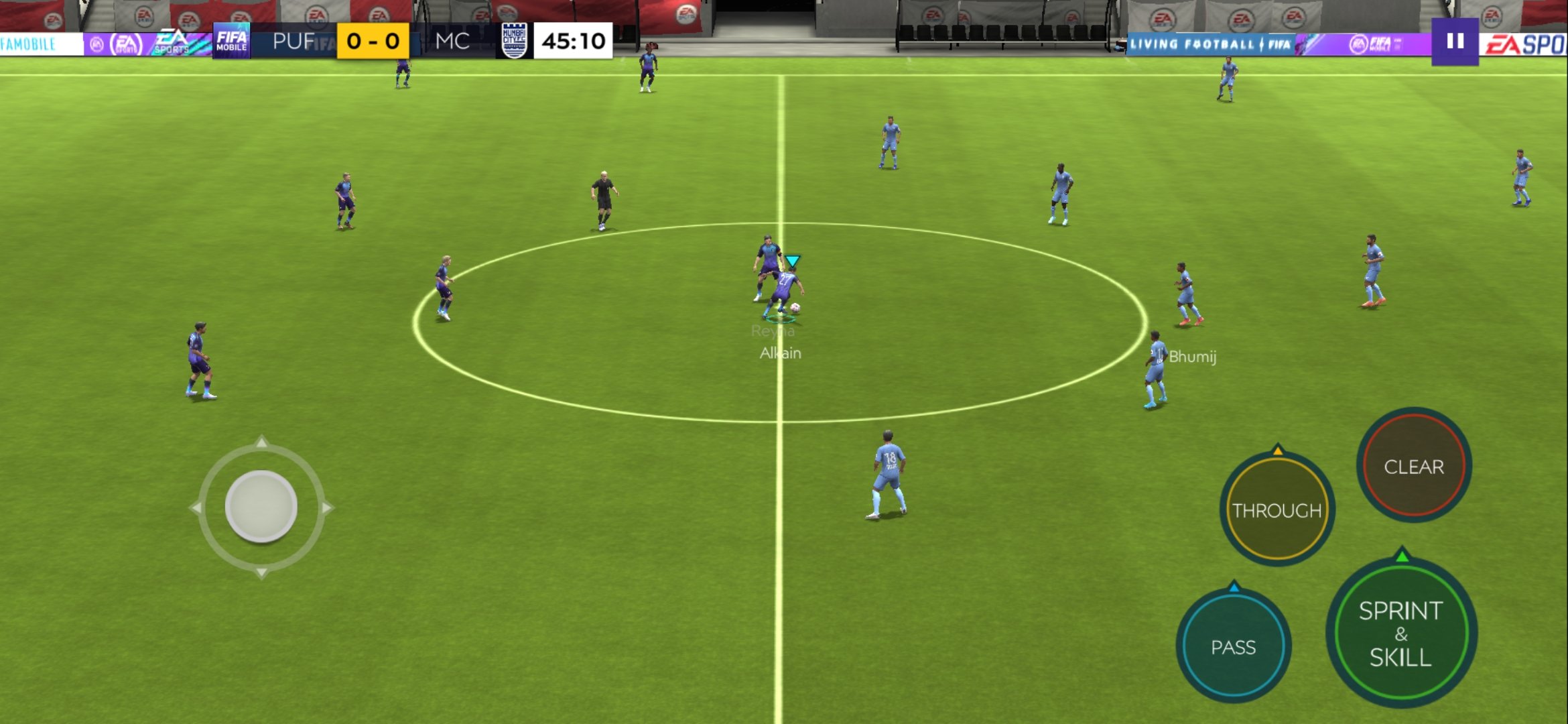
The point of the game is to score against the opposing team. Each team has 11 players, with a total of 22 people on the field. Unfortunately, in a game that recreates teams as in real life, their uniforms can often have very similar colours. In case one team has a light blue colour and the other a slightly darker one, it can be hard to make out who you’re playing as!
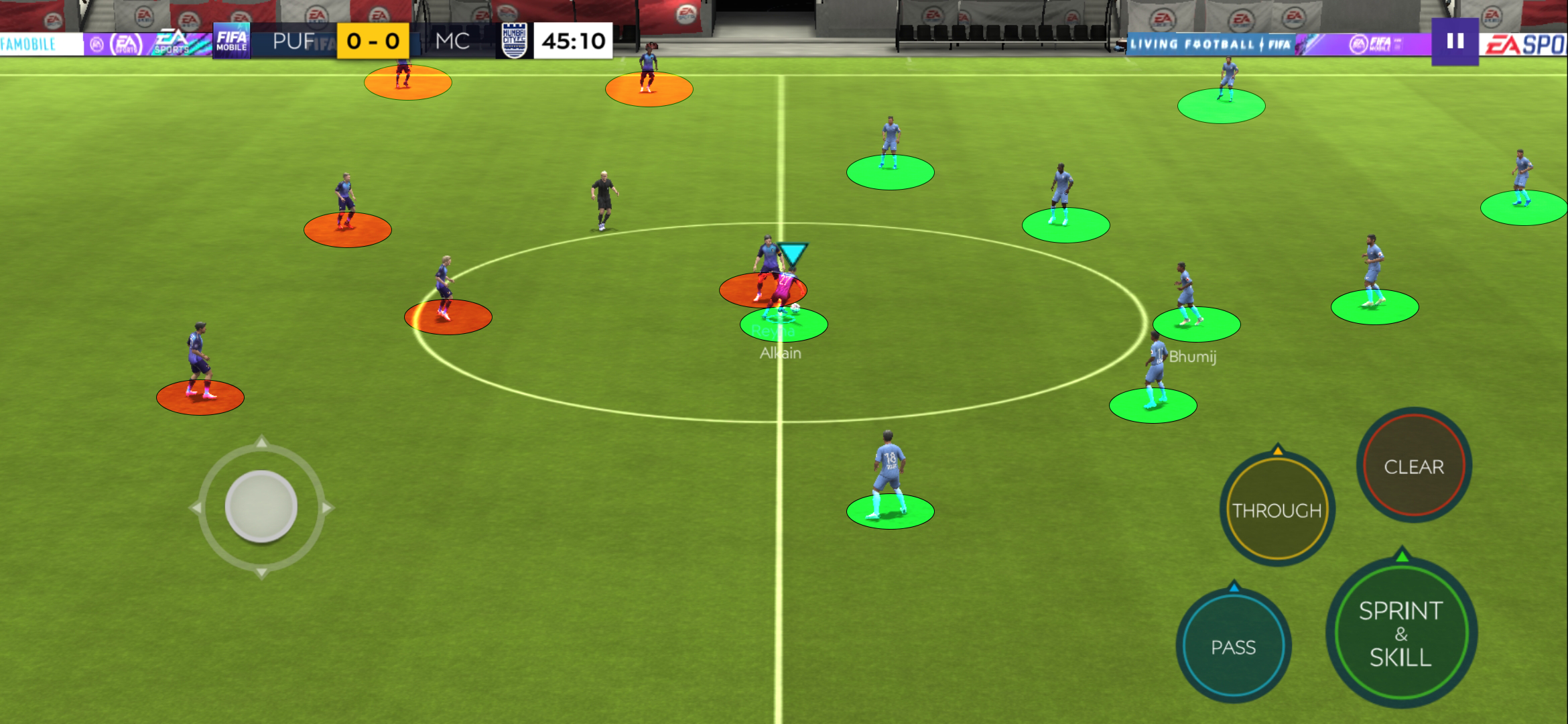
A clearer UI separating your team from the other and a bigger pointer for the player holding the ball are necessary for a smoother experience.

Direction of movement
The player with the ball has at its feet an arrow indicating the way it’s moving or facing. However, due to the perspective and absence of line of action, it’s hard to tell which way it’s actually going to run or shoot.
An higher angle or dashed line indicating where the ball would roughly go when shooting would greatly aid new players better understand the mechanics.

Unexplained new elements
During the very first match of the game, the player is surprised by many new elements. For example, the buttons Through and Clear aren’t explained beforehand. Normally this could be fine if the game is not fast paced, but this being a football match there isn’t much breathing room as you dribble through the opponents and try to score. It could have been fine if at least we were told about the pause button on the top right, but even that was noticed when looking at the screenshots after experiencing the game.
Another feature that I only happened to noticed thanks to testing the game with other players, is the Sprint & Tackle button changing to Sprint & Skill. This is hard to notice when playing because the thumb is constantly over it, covering the text. Perhaps this doesn’t affect the gameplay too much, but I wouldn’t know as once again the tutorial doesn’t explain what Skill means or does.
The solution for these is simple: introduce these features before the first match.

Final Impression
With more time I would have researched more into other action mobile games and the team management system. Overall, the game needs a deeper dive into accessibility at least for its mobile version, as of now it is tailored for the console/computer experience.